Author: begerp2013

Blog Entry 6: Beyond Coal – Michigan Blog

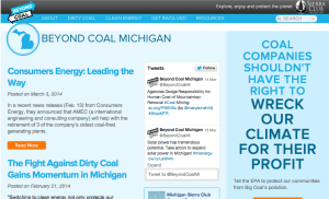
The Beyond Coal website is designed just like a blog. It has a list of posts stacked on top of each other along side another column for social media and a third for donations.

Screen Shot 2014-03-18 at 6.38.32 PM

The section with the blog posts will be what I focus on in this brief analysis:

First, I should mention that I wrote 3 out of the 5 blogs on this list, that are still the 3 most recent posts. Clearly, I am currently the only one who is given assignments in this category. Secondly, my posts were approved by my campaign overseer who encouraged me to follow the similar style and tone of other posts on this site and related ones, including social media. So I when I critique the site I am simply critiquing the overall goal and how it is executed rather than the blog posts themselves (since I am probably not the best person to critique my own posts).

The target audience seems to be younger people and others who consider themselves environmentalists IN MICHIGAN, including donors, volunteers, and those looking for more information. However the purpose of the blog is centered around  informing and keeping interested people up to date. It could also be used to attract more people, whether that is donors, volunteers or enthusiasts.

To be honest, even though I work here, the blog is extremely weak. Since I am the only one posting, there is not enough information at all, it also looks pretty unattractive to read in the current design / layout. Considering their purpose is to provide up to date info and keep people informed, they are doing a very bad job of this. There are so many different sites that are part of the overall Sierra Club, that I feel like this site should simply be removed it there is not going to be more focus on it. Its possible that the lack of info and appeal could actually turn potential donors, volunteers, and other activists away. Therefore, I would actually recommend that they remove this, since their social media is doing a much better job anyway.

The information in the posts are solid, but the design and lack of content completely discourage people from clicking on it. Finally, this blog takes one approach only, which is to inform and possibly entertain with up to date info. However, like our last reading mentioned, simply providing facts is not enough to attract readers, nor is simply telling stories without facts. This blog does nothing to appeal to any emotions and does not wrap any facts up with important stories and photos. Overall, it is failing.
Internship Update (Blog post 5)

So far I have been doing roughly 4 hrs of work per week for the Beyond Coal campaign. I am proud of what they are doing and am still excited about the goal, but I am realizing how much patience and determination it requires to make the slow progress that is necessary. Even being a very part time volunteer, I can understand how it must seem like a constant uphill battle.

Most recently, I wrote a blog post about a press event for the Beyond Coal campaign. They are currently gathering signatures from local businesses in support of clean energy that they would like to buy from DTE if they would provide it. So essentially a petition for clean energy. They will pass this on to DTE once they reach around 200 signatures, simply to pressure them further.

I am also attempting to organize an event on the Diag on March 19th, in which we plan to get as many people as possible to flood DTE’s voicemail box with requests for more clean energy and against dirty coal energy production. Since we are not affiliated with a student org, I am not sure if I will be able to officially plan it, but I plan on doing it either way.

Finally, I am very thankful for this experience because it has given me a better idea of what working for a non-profit could be like. But sometimes, I feel like working for a cause like this stresses me out and gives me a more negative view on the world. I wish I could say I don’t feel that way but sometimes I do because it seems like progress takes a lot of time and there are so many legal hurdles and private companies that stand in the way. I am currently questioning if I could take on this type of work full time.

So I have recently been thinking over a new option for the future. Instead of working full time for a non-profit, maybe I would work full time in a job that can pay me a wage I would be more satisfied with, and then donate some time and money regularly to non-profits that I support.

I would be very curious to know if anyone else has felt the same way and/or contemplated the same thing. I would be interested to hear your opinion.

My Mini-Assignment 1

Review of Sierra Club – Michigan (My design)

(http://begerp.wix.com/sierra-mi-idea)

After searching for a good template to use in Wix, I feel I found a good one for what I decided to design for the Sierra Club Michigan Site. The original site needed a lot of improvement (http://michigan.sierraclub.org). I wrote a review of the original in my latest blog: begerpnonp.wordpress.com. But to explain what I did with this site, I will use our same review sheet.

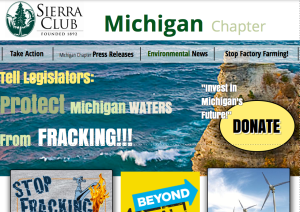
1. Gestalt: I wanted to make the site stand out right away, as I feel the original did not at all. There are some many beautiful places in Michigan, I felt like it had to have a large panoramic photo so I decided to include one. I kept the menu links very big and easy to find, and put a huge donate button on the right side. So I hope it appeals to the user

2. Purpose: I feel the purpose of the original site was to educate, so I followed a similar format. I included some links to the major topics they had on their page, and included the same words in their descriptions. But I did remove some of their text to make it simpler, and formatted it a little differently with effects and spacing to make it more appealing. And like I mentioned, I kept the donate button and made it much bigger.

3. Audience: One major change that I think my site makes is the audience it appeals to. There is no doubt mine has a newer feel, with bolder colors and a more modern format. This may appeal to a younger audience but that is not necessarily the intention. The goal was to make it simpler to understand, so that could benefit any age group.

4. Writing: Like I mentioned before, I think their original text was worded well and was pretty concise. So I kept that the same, I just reformatted it a little bit. I also chose to not include a whole ton of writing from their original page, and used the menu at the the top as a way to access the rest of that information, though the links clearly don’t lead to them.

5. Visuals: I did the best I could to make the site look appealing. I used one of the best pictures of Michigan I could find. I used a familiar color scheme throughout the whole page. I used the exact pictures off of the original site, but I did change their size and gave them some effects to help them stand out. I also used very big colorful lettering in some locations to make the text stand out when needed. Finally, I used a official Sierra club logo at the top and used a large basic font for the Michigan Chapter.

6. Navigation: All my links should work, though they do not lead anywhere real. I tried to place things in locations that would be easy to find, so navigating the site should be pretty easy (ex: the boxes at the bottom of the page for social media and related links).

7. Social Media: Like I mentioned the box at the bottom has the links to social media, though they are not real links.

8. Other: I would think that the SEO would be pretty good for my site, because there are a lot of keywords, there is meaningful text, and there are a number of links. I followed a lot of the advice from our readings.

9. Strengths: I think one of the biggest strengths of my site is the appeal. The design should give it an exciting, and energetic feel, which could be good for getting donations and volunteers. The site should be very easy to navigate as well and the text is all very relevant and concise.

10. Weaknesses: I think there could be some issues with professionalism. Depending on the type of feel the Sierra Club would prefer, they may think my design is too young or unprofessional, or perhaps that it doesn’t include enough information on the home page. I’m also not too sure how accessible it is.

Screen Shot 2014-02-12 at 1.17.21 AM


Analysis of Sierra Club – Michigan Chapter

Since this is the site I am currently remaking, I thought it would be a good choice for this blog post. The site is: http://michigan.sierraclub.org

I am going to use the worksheet we used in class to analyze this website.

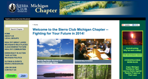
1. The Gestalt: Right off the bat the site looks way too busy. There are about 20 links in just the first glance of the site, before I even scrolled down. There are some decent looking pictures but the arrangement is busy, unorganized and includes too many colors. There is a somewhat organized line of links that could be considered sub categories, but they do not stand out very well since they are on the left hand side and not across the top. The four pictures in the middle look good but the placement and layout is not appealing. Overall does not seem very professional and looks more like a bulletin board than anything else.

2. Purpose: The purpose seems to be: gain more information about the Sierra Club – Michigan Chapter. There is a donate button on the bottom left, but that doesn’t seem to be a big focus.

3. Audience: The intended audience is hard to identify. I would have to say it is directed at Michiganders, but what type of Michigander is unclear. It does not have many modern design elements so it will not appeal to many young people. I would say middle age people, or those who are not as tech savvy.

4. Writing: The writing is essentially a bunch of links, one on top of the other, written as a title for each. So for that reason the writing is clear and professional, but it does not go into any detail about any one of the links because there are so many. The photos have titles below them that are also used as link info. The descriptions of the links are direct and well written.

5. Visuals: The photos on the site are good, clear and focused. However some of them are too small and appear to be cut off. Although the photos themselves are good, the surrounding design does not complement them at all.

Design: I will include this in the visuals eval. The design of this site is its ultimate down fall. The information, links and photos are all relevant and well written, but the design makes them completely unappealing to click on. Most of the site includes links that are stacked one on top of the other in very small text. The logo at the top is also small and does not stand out. Another huge flaw is the color scheme. The flaw is that there is none. Or at least it is not very obvious. The links and pictures on the right hand side are in a completely different color scheme than the rest of the site… I could go on for a while here.

6. Navigation: The navigation is good. Every link leads to a relevant page (though I don’t have time to check all of them)

7. Social media is not very present at all. There are very small links on the right hand side of the page, but they might as well not even be there since they are so small and unappealing.

8. Other: I think the SEO on this page is probably pretty high based on the number of links and keywords. Not too sure about accessibility.

9. I elaborated on the strengths and weaknesses throughout this post

Screen Shot 2014-02-11 at 3.10.33 PM

My Internship with Sierra Club

If the title doesn’t give it away, I will be interning with the Sierra Club this semester, and I am very excited. I originally thought the Ecology Center would be a good option, but I ended up receiving an email from an animal rights group on campus that mentioned the Sierra Club was looking for interns. After reading that they will be attempting to decrease DTE’s use of coal as their primary source of energy, I became more interested in that project because improving the environment is possibly my favorite area of non-profit work. 

For my assignment, I have been told that I will need to attend a couple press / media conferences to get a better idea of exactly how the Sierra Club plans on fighting DTE and learn what specific messages they plan to put out to achieve that. First, I will be creating blog and web content to try and encourage web users to sign an online petition, I will update social media and possibly add media content, and may help with writing press content and will possibly do some local, dirty work of putting up flyers around campus to get more online signatures. 

Ultimately, Sierra Club is suing DTE for violating some environmental laws and they will need a lot of community support in order to win any lawsuits. So I will do whatever I can to help with that. 

Image


image cred: alaska.sierraclub.org

Mansfield Web 1.0 Response

I just recently finished reading this useful piece of information of some basic tips for Non-profit, web 1.0 management. And I must say I am glad I did not feel left in the dust. Most of the information seemed mostly obvious and very easy to follow (especially when she mentioned that spelling errors are much less easily received in web 1.0 sites than in 2.0 sites). It seems that understanding what is currently popular and ‘hip,’ in website land is one of the most vital aspects of being a successful non-profit. Heather mentioned aspects like having your own branding on “donation” screens as well as using your own site name as your email address rather than going through google, yahoo, or even outlook express, which definitely seemed obvious to me, but maybe not to those who have been in the game longer and have had trouble keeping up with the constant changes. This gives me hope that I will actually have some useful knowledge to offer when it comes to understanding what consumers expect out of modern day non-profits and their web presence. As a consistent reader of non-profit e-newsletters and someone who has had much experience navigating the web, I am realizing that may be useful knowledge after all. 


Allow myself to introduce… myself

More info about myself can be found on my About page. But let me explain why I am here.

I like this quote from Steve Jobs:

“Being the richest man in the cemetery doesn’t matter to me … Going to bed at night saying we’ve done something wonderful… that’s what matters to me.”

I think that says a lot about why I am taking this class. Since I have prolonged my time in getting a college degree, I am now a 25 year old undergraduate junior. And I am totally happy about it. Because when most of my friends were going to big name colleges out of highschool, I was taking classes at the community college near me, questioning why I am even doing that in the first place.

I ended up spending some extra time in the real world, chased my passion for music and moved to Chicago for a couple years, until I eventually decided I still don’t know for sure what I want to do but I definitely don’t want to work retail anymore.

But these experiences gave me a new outlook and a deeper understanding of why I want a degree, and what I want to do in life. Money seems like a never ending chase, and the more I think about striving to simply make money, the more I realize how little I care about it. It easy to look out for yourself, self improve all the time and be richer than the next guy. In other words we can all compete with eachother to be better than the rest, or we could help eachother out and be happy with what we have. That sounds a lot more fun to me, and whenever I want to go on a yacht I will just ask a rich friend to take me on a ride.